Most LinkedIn posts look the same: walls of plain text that blur together in the feed.
Then there's that one post that catches your eye. It has bold headers, clean line breaks, and visual structure that makes it easy to read.
Guess which one gets more engagement?
Today we're showing you exactly how to format LinkedIn posts properly using Triorama's free LinkedIn text formatter. No copy-pasting from random websites, no hunting for Unicode characters—just simple, fast formatting that works.
Why Formatting Matters on LinkedIn
Before we dive into the how, let's talk about why formatting matters.
The Scroll-Stopping Problem
LinkedIn is a feed. Users scroll fast. Your post has maybe 1-2 seconds to stop someone's thumb.
Plain text doesn't stop scrolls. Formatted text does.
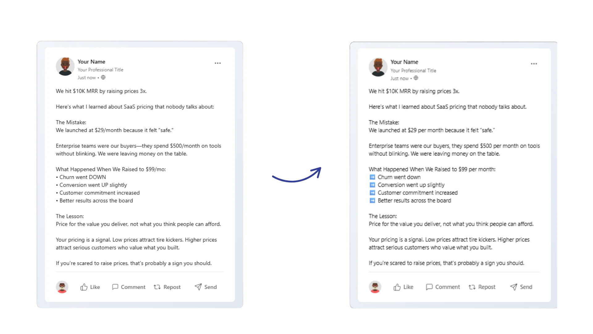
Readability = Engagement
When someone stops to read your post, formatting determines whether they finish.
Hard to read: Dense paragraphs, no visual breaks, everything blends together.
Easy to read: Short paragraphs, bold key points, clear structure that guides the eye.
Posts that are easy to read get:
- Higher dwell time (algorithm loves this)
- More complete reads
- More comments and engagement
- Better conversion on CTAs
Mobile First
Over 60% of LinkedIn usage is mobile. On a phone screen, unformatted posts are torture to read.
Formatting creates visual breathing room that works on small screens.
Formatting Options for LinkedIn
LinkedIn doesn't have a native rich text editor for posts. No bold button, no italic button, nothing.
But there's a workaround: Unicode characters.
Unicode includes special character sets that look like bold and italic versions of regular letters. When you use these, LinkedIn displays them as formatted text.
Instead of typing "Hello" you use Unicode to type "𝗛𝗲𝗹𝗹𝗼" — it looks bold, works everywhere LinkedIn displays text, and doesn't require any special tools on the receiving end.
What You Can Format
| Format | Example | Use Case |
|---|---|---|
| Bold | 𝗧𝗵𝗶𝘀 𝗶𝘀 𝗯𝗼𝗹𝗱 | Headlines, key points, emphasis |
| Italic | 𝘛𝘩𝘪𝘴 𝘪𝘴 𝘪𝘵𝘢𝘭𝘪𝘤 | Quotes, secondary emphasis, titles |
| Line breaks | ↵ | Paragraph spacing, readability |
| Emojis | ✅ 🚀 💡 | Visual markers, personality |
| Bullets | • | Lists, structured content |
| Numbers | 1️⃣ 2️⃣ 3️⃣ | Numbered lists, steps |
What You Can't Format
Strikethrough— Not supported in most Unicode fonts- Underline — Not available
- Links with custom text — LinkedIn only shows raw URLs
- Colors or fonts — Plain black text only
Using Triorama's LinkedIn Text Formatter
Enough theory. Let's format some posts.
Head to our free LinkedIn Text Formatter to follow along.
The Interface
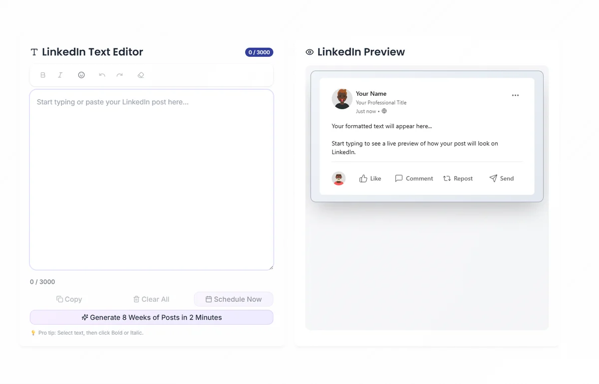
The formatter has two main areas:
- Text Editor — Where you write and format your content
- LinkedIn Preview — Real-time preview showing exactly how your post will look
Basic Bold and Italic
To bold text:
- Select the text you want to bold
- Click the B button or press
Ctrl+B(Windows) /Cmd+B(Mac) - The text converts to bold Unicode characters
To italicize text:
- Select the text you want to italicize
- Click the I button or press
Ctrl+I(Windows) /Cmd+I(Mac) - The text converts to italic Unicode characters
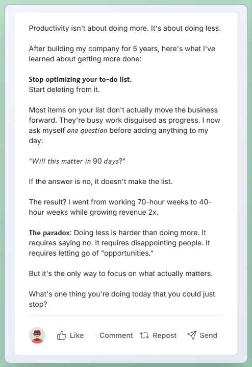
Line Breaks and Spacing
LinkedIn collapses multiple line breaks into one. To create visual spacing:
Single line break: Press Enter once Visual paragraph break: Use an empty line with a special character
The formatter handles this automatically when you create paragraphs.
Adding Emojis
Emojis work as visual anchors that draw the eye to key points.
Built-in emoji picker:
- Click the emoji button in the toolbar
- Browse or search for the emoji you want
- Click to insert at cursor position
Common business emojis:
- ✅ Checkmarks for lists
- 🚀 Launches and announcements
- 💡 Insights and ideas
- 📊 Data and metrics
- ⚡ Speed and efficiency
- 🎯 Goals and targeting
Use emojis as visual markers, not decoration. 1-3 per post is professional. 10+ looks spammy.
Creating Bullet Lists
For bullet lists:
- Use the bullet character: •
- Add your list items
- One line break between items
The formatter's bullet button inserts properly spaced bullets automatically.
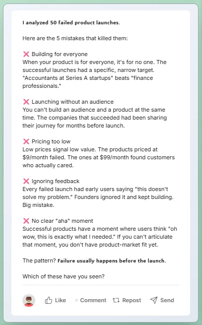
Copying to LinkedIn
When your post is formatted:
- Click "Copy to Clipboard" or select all and copy
- Paste directly into LinkedIn's composer
- The formatting transfers perfectly
Formatting Best Practices
Now that you know how, let's talk about when and where to use formatting.
Rule 1: Bold Your Hook
The first line of your post should stop the scroll. Make it bold.
Example:
𝗜 𝘀𝗽𝗲𝗻𝘁 𝟯 𝘆𝗲𝗮𝗿𝘀 𝗯𝘂𝗶𝗹𝗱𝗶𝗻𝗴 𝘁𝗵𝗲 𝘄𝗿𝗼𝗻𝗴 𝗽𝗿𝗼𝗱𝘂𝗰𝘁.
Here's what I learned...
The bold first line grabs attention. The regular text provides the payoff.
Rule 2: One Idea Per Paragraph
Keep paragraphs short—2-3 sentences maximum.
On mobile, long paragraphs are walls of text. Short paragraphs create visual rhythm.
Bad: "I was working on a project last year and realized that we had been approaching it completely wrong the entire time. Our team had spent months building features nobody asked for because we never talked to customers. It was a hard lesson but an important one."
Good: "Last year, I realized we'd been building the wrong thing for months.
We never talked to customers.
We built features nobody asked for.
Hard lesson. Won't make that mistake again."
Rule 3: Use Bold for Emphasis, Not Decoration
Bold text should highlight key points, not every other word.
Bad: "I was working on a project and realized we were doing it wrong."
Good: "I was working on a project and realized we were doing it completely wrong."
One bold phrase draws the eye. Five bold words creates noise.
Rule 4: Headers for Long Posts
If your post is 200+ words, add section headers to help readers navigate.
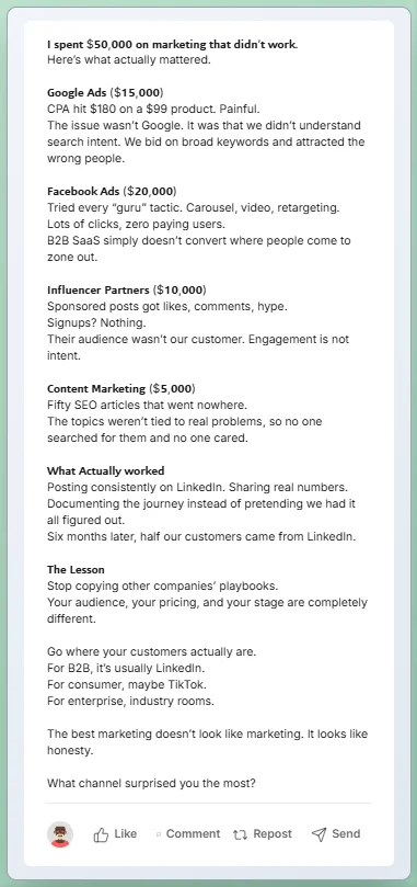
Use bold for your headers, followed by a line break:
𝗧𝗵𝗲 𝗣𝗿𝗼𝗯𝗹𝗲𝗺
Most founders struggle with consistency...
𝗧𝗵𝗲 𝗦𝗼𝗹𝘂𝘁𝗶𝗼𝗻
Here's what actually works...
Rule 5: Strategic Emoji Placement
Use emojis to:
- Mark list items (✅ instead of •)
- Add visual breaks between sections
- Highlight key points
- Add personality to dry content
Don't:
- Use 🔥🔥🔥 after every sentence
- Replace words with emojis
- Use emojis that don't match your professional brand
Rule 6: Whitespace Is Your Friend
Don't fear empty space. Readers' eyes need room to rest.
After a key point, add an extra line break. Let it breathe.
Common Formatting Patterns
Here are formatting templates that work well on LinkedIn.
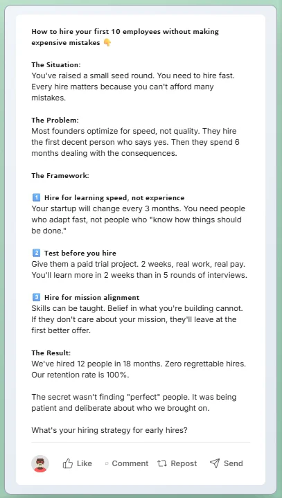
Pattern 1: The List Post
𝗫 𝘁𝗵𝗶𝗻𝗴𝘀 𝗜 𝗹𝗲𝗮𝗿𝗻𝗲𝗱 𝗮𝗯𝗼𝘂𝘁 [𝘁𝗼𝗽𝗶𝗰]:
1️⃣ First thing (Brief explanation)
2️⃣ Second thing (Brief explanation)
3️⃣ Third thing (Brief explanation)
What would you add to this list?
Pattern 2: The Before/After
𝗕𝗲𝗳𝗼𝗿𝗲: ❌ Problem 1 ❌ Problem 2 ❌ Problem 3
𝗔𝗳𝘁𝗲𝗿: ✅ Solution 1 ✅ Solution 2 ✅ Solution 3
Here's how I made the switch 👇
Pattern 3: The Story Structure
𝗧𝗵𝗲 𝗺𝗼𝗺𝗲𝗻𝘁 𝗜 𝗿𝗲𝗮𝗹𝗶𝘇𝗲𝗱 [𝘀𝗼𝗺𝗲𝘁𝗵𝗶𝗻𝗴]:
[Setup paragraph - what was happening]
[Conflict paragraph - what went wrong]
[Resolution paragraph - what I learned]
𝗧𝗵𝗲 𝘁𝗮𝗸𝗲𝗮𝘄𝗮𝘆: [Key lesson in bold]
Pattern 4: The Hot Take
𝗨𝗻𝗽𝗼𝗽𝘂𝗹𝗮𝗿 𝗼𝗽𝗶𝗻𝗶𝗼𝗻: [Your take]
Here's why 👇
[Reasoning paragraph 1]
[Reasoning paragraph 2]
[Reasoning paragraph 3]
Agree or disagree?
Keyboard Shortcuts Reference
For power users, these shortcuts speed up formatting:
| Action | Windows | Mac |
|---|---|---|
| Bold | Ctrl + B | Cmd + B |
| Italic | Ctrl + I | Cmd + I |
| Undo | Ctrl + Z | Cmd + Z |
| Redo | Ctrl + Y | Cmd + Shift + Z |
| Select All | Ctrl + A | Cmd + A |
| Copy | Ctrl + C | Cmd + C |
| Paste | Ctrl + V | Cmd + V |
Formatting Mistakes to Avoid
Mistake 1: Over-Formatting
When everything is bold, nothing is bold. Use formatting sparingly for maximum impact.
Mistake 2: Inconsistent Formatting
Pick a style and stick with it. If you bold headers, bold all headers. If you use ✅ for lists, use ✅ for all lists.
Mistake 3: Forgetting Mobile Preview
Always preview how your post looks on mobile. What looks great on desktop might be unreadable on a phone.
Mistake 4: Walls of Emojis
🚀🔥💯🎯✨ at the end of every line = spam vibes. Keep it professional.
Mistake 5: Not Previewing Before Posting
Unicode formatting can sometimes look different than expected. Always preview before you post.
Quick Formatting Checklist
Before you hit post, verify:
- Hook is bold and attention-grabbing
- Paragraphs are short (2-3 sentences max)
- Key points are bold for emphasis
- Line breaks create visual breathing room
- Emojis are used sparingly and purposefully
- The post looks good in mobile preview
- CTA or question at the end
Advanced Tips
Tip 1: Create a Swipe File
Save your best-formatted posts as templates. When you need to write, grab a template and fill in the content.
Tip 2: Test Different Formats
Track which formatting styles get the most engagement. Double down on what works for your audience.
Tip 3: Match Format to Content
- Stories: Minimal formatting, let narrative flow
- Tutorials: Headers, bullets, clear structure
- Hot takes: Bold hook, short paragraphs
- Lists: Numbered or bulleted with visual markers
The Tool That Makes This Easy
You can hunt for Unicode characters, copy from random websites, and hope the formatting works.
Or you can use our free LinkedIn Text Formatter.
What it does:
- Bold and italic with one click or keyboard shortcut
- Built-in emoji picker with business-appropriate options
- Real-time LinkedIn preview
- Clean copy-paste to LinkedIn
- Completely free, no account required

The Bottom Line
Formatting isn't decoration. It's communication.
Well-formatted posts:
- Stop the scroll
- Guide the reader's eye
- Make content digestible
- Increase engagement
- Look professional
The tools are free. The techniques are simple. There's no reason your next post should be a wall of plain text.
Ready to format like a pro?
Try our free LinkedIn Text Formatter — bold, italics, emojis, and real-time preview. No signup required.

